Premier Video Final Draft

The video turned out really well. This was designed to be a clear visual story of bullet journaling and what I did to create a spread. My friend helped my film. Due to the way that the room was set up, we were only able to get footage from my left side. This made it difficult to distinguish between scenes. I used varying zoom levels to help distinguish shots.

This is the second draft of the video story and I am a lot more satisfied by it. I feel like the major changes that I made really helped out the piece to make it feel smoother. For example, I took out the choppy bit of audio at the beginning from the first draft, added in a small audio slide for the beginning transition. Also, at the end, I made a slide to fade and added a transition to the image of dip to black for the end of the video. I felt it was a very smooth end to the video as opposed to the abrupt end of the first draft. It took a while to figure out how to use audio volume controls and how to use key frames to create a nice fade of volume.

I used the same background music that I used for my Audition audio story because I felt it hit the mood really well and also I wanted to keep the media thematic and consistent. I felt the bubbly bouncy tone of the music helped with the background. I worry that the music might have been just a tad too quiet, but I would rather the music be too quiet rather than too overpowering.

I did not receive any peer feedback because I did not post my draft in time. Therefore, I cannot include any peer comments on my final project.

Background music was found here under the CC0 1.0 Universal License.

http://freemusicarchive.org/music/Loyalty_Freak_Music/POSITIVE_ATTITUDE_/Loyalty_Fr

eak_Music_-_POSITIVE_ATTITUDE__-_01_Go_to_the_Picnic

Video Draft

This is very much like what I had originally planned it to be like. There are lots of journaling videos out there which show the entire process of bullet journaling; however my camera did not have enough space on it to fully film everything. My friend was able to help out the day of the filming, so we were able to get a few different angles. However, due to the way my room is arranged, we were only able to get a lot of shots from the left hand side.

Several individual shots were compiled to make a cohesive story of the progression of the spread. This was done to show people the process of making a bullet journal. I sped all clips up to 200% and used five second clips to make the sequence.

There was a lot of technical difficulty because originally the images showed up and were oddly zoomed in. After about an hour of trying to figure out what the heck was going on, I finally figured out how to adjust the size of the photos and the video to what I wanted. I even used this effect to my advantage and was able to zoom in on some clips to make them seem like they are from a different angle or shot. This was helpful in distinguishing shots like we had done in the first tutorial. Especially since most of the video was shot from my left.

I think that this could be improved upon by adding some music and smoother transitions. I also want to prolong the picture at the end for a couple more seconds so that it can fade out for a nice transition.

Ultimately I am very pleased with how this video went. I think the audio could have been a little smoother, but oh well.


Premier Raw Footage

Video Title- Journal With Me for COM210

Visual Elements Audio Elements
0:00-0:05

My bullet journal

“I am going to teach you  how to bullet journal.” Bouncy music in the background
0:05-0:15  Examples of other bullet journal entries There’s no specific way to bullet journal, there are plenty of styles and aesthetics
0:15-0:20  rolling photos of finished bullet journal This is a quick look at how my design today turns out, and now you can journal with me and see me through my process
0:20-0:45 sped up footage of me bullet journaling. Bouncy music
0:45-0:50 normal speed finishing touches on spread Bouncy music
0:50-1:05 multiple shot close ups of different features of my bullet journal spread finished I will discuss what I liked about this spread, what could have been better, and options I was considering.


Audio Story Draft

In this audio file I originally didn’t know what I was going to do when I got the original interview raw audio footage. I decided afterwards to make a comparison of the different styles of bullet journaling in a podcast type audio story. The inspiration came because my two interview subjects had two drastically different takes on bullet journaling. Because their different takes could not be adequately summed up just by placing the two interviews together, I created a narration to accompany the sound bites from the interviews. However, somewhere along the way, it turned into a narration accompanied by sound bites.

For the accompanying music, I wanted something that was lighthearted and bouncy. It didn’t take much searching to find something perfect for my topic. This back ground track set up the perfect tone for the relaxing, fun, and creative hobby that is bullet journaling.

I understand that the first draft of this audio story is a tad rough. The interview sound bites are particularly rough. I will fix those up at a later time this week most likely. Also, I am fully aware that the background audio is a tad loud compared to the actual interviews. So I will attempt to make it a better volume over all. The interview of my friend Mackenzie is also oddly quiet for some reason; perhaps it is because I recorded the phone conversation rather than an actual live in person audio interview. I will also make an attempt to fix that up during this next upcoming week.

Over all I’m pretty satisfied with the narrative I came up with since it serves well as an explanation for the different styles of bullet journaling. Especially considering that I had no idea about what I was going to do for this until Thursday afternoon.

Background music was found here under the CC0 1.0 Universal License.

http://freemusicarchive.org/music/Loyalty_Freak_Music/POSITIVE_ATTITUDE_/Loyalty_Fr

eak_Music_-_POSITIVE_ATTITUDE__-_01_Go_to_the_Picnic

Logo Final Draft

LazilyStudying-Final-Draft

It’s been a process getting to this logo, that’s for sure. I originally was inspired to do a minimalistic logo like this one that featured common supplies for bullet journaling. While the pens and sharpies are obvious as to why they are included as common supplies, the cup may not be. Personally, I bullet journal to relieve stress and to have an artistic outlet. Usually when I am bullet journaling, it is a calm and relaxing environment, often with a cup of tea on my desk with me as I work on my bullet journal.

I wanted to keep the design minimalistic and keep it down to black, white, and one complimentary color. In keeping the color scheme simple and sharp, I was very limited in terms of supplies that could easily be portrayed in my logo. In my sketch, I featured a pen, a pencil (in multiple colors) and a purple marker. While the colors did all fit well together due to them all being a warm pastel color, there were simply too many colors for any of them to truly pop.

In the first draft stage, I couldn’t think of another material that could be recognized using only black and white. I attempted making scissors, however the scissors were primarily black and skewed my 50 percent- 30 percent- 20 percent color ratio I had going on.

Scissors made the image seem imbalanced. Since this design is a circle, I felt the need for balance was extra strong. In my draft, I featured two pens simply in effort to balance the image, but it still felt off balance with the cup being too heavy in the picture. In the final draft, I finally realized I could make some sort of sharpie-like figure and add it in between the two pens so that the picture felt more balanced with three small objects to counter act the large cup.

The last big change I made was the placement of the font. In the draft, the font was on the cup, however I realized that that limited its size and therefore its scalability. In my final draft I decided to change the font and place it outside of the cup. While this makes it feel like the 50-30-20 color ratio was kind of skewed and that perhaps the black and white changed places (the white being 30 percent in the draft and the black being 30 in the final logo), this fixed the more important issue of scalability.

I only received one peer review on my design, and while it gave several positive critiques, it did not give me any constructive criticism. They did not supply anything to fix or change.

The font used in this final does not belong to me. It is called Code and belongs to the author Fontfabric. The font was free to use. It can be found at https://www.dafont.com/code.font

Logo First Draft

LazilyStudying-First-draft-JPEG

When it comes to social media, Bullet Journals and study notes are often lumped into similar categories, especially when the owners of these accounts are still in school. On Instagram specifically, these bullet journal and study note focused pages are referred to as “studygrams” due to their generally academic and organized nature. I decided to make my logo as a new cover image for my bullet journal social media pages.

In doing so, I made sure to follow the general aesthetic of most of these studygrams. The general aesthetic focuses on soft colors, and minimalistic designs to convey simple meanings. I chose the mint green as a nice subtle background to give my logo liveliness and to pop out without being too hard on the eyes.

In my original logo sketch, I included a pencil and a purple marker. However, after discovering the versatility of single or two- color logos, I decided to cut back on colors and simply make black and white the primary ornaments inside the logo so that I didn’t have too much color.

In my logo, I wanted to convey what the most basic elements on bullet journaling are, and that is a relaxed creative outlet. With this idea in mind, I chose to use the mug to convey a sense of relaxation, casual work, and warmth. With the pens, I wanted to show that I am creating something.

In the end once I decided I wanted to get rid of the previously mentioned pencil and marker which were in the original designs, I was unsure with what to fill that space. I knew that I could not simply have a huge mug and a singular pen because that image would be horribly imbalanced. I attempted to add a pair of scissors, which are heavily used when bullet journaling, but it ended up throwing off the balance even more. I could not think of a piece of stationary that is so color neutral and that could be easily done with just black and white as a pen. So I made two pens in an attempt to balance the image. I will keep thinking on what bit of stationary could be made to balance the image and will most likely update it for my final draft.

Credit to Darrell Flood for Ultra Thins font

https://www.dafont.com/ultrathins.font

Final Draft Photoshop Bullet Journal

FINAL-DRAFT
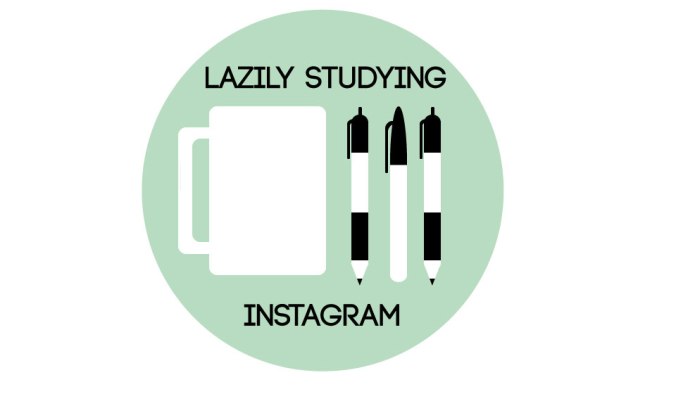
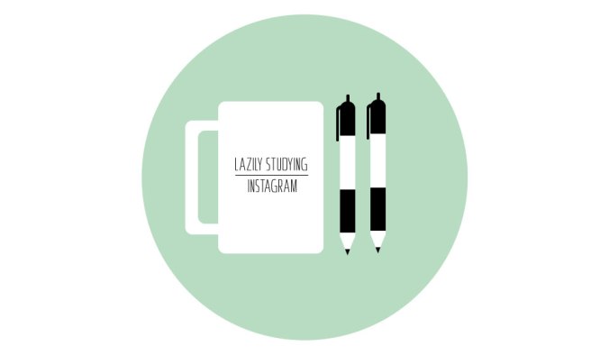
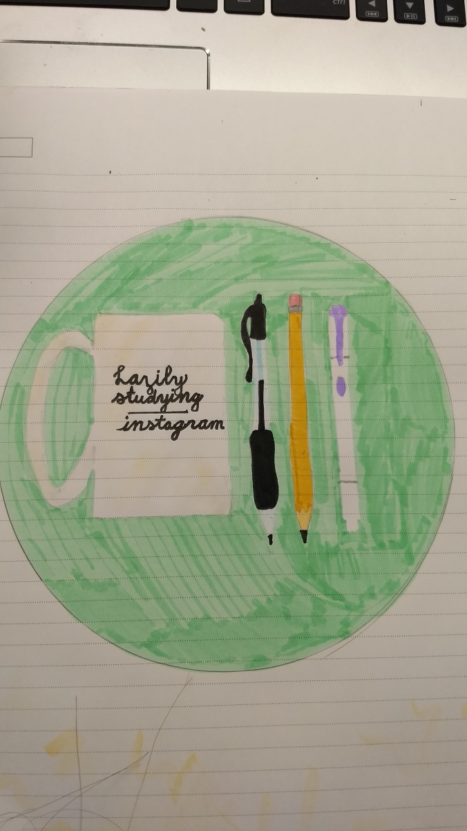
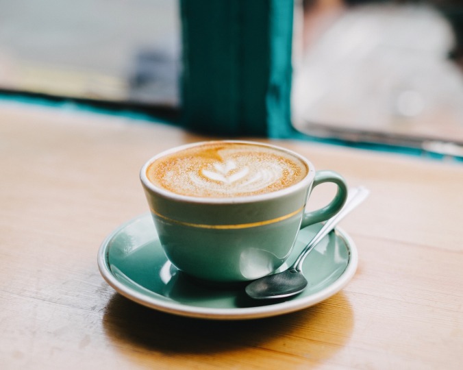
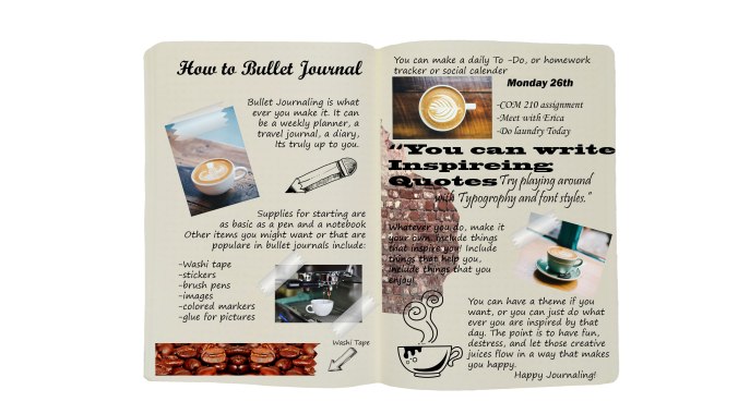
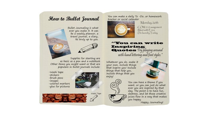
Just like bullet journaling, photoshop has no set rules or standards. It is a medium of art, that yes, has some basic foundations and tools, but in the end, can be anything you want it to be. Here I present my 100 percent photoshopped bullet journal design. Here, I made a kind of “how to”, ironically though, the “how to” basically just says to individualize the piece of art for your own liking. Bullet journaling is all about creating a scrapbook like design that makes you happy in the end. The journal can be full of drawings, stickers, photos, quotes, your weekly plans, anything really.

I have to say, It’s been quite the process making this. While it has just been a class project, I found that it deepened my love for bullet journaling by showing me the different mediums where it can be done. This image is the result of an assignment for my Com 210 class. It started out with some ideas for a draft. Then the draft ensued. I got some feedback from peers also in this class. Taking that feedback into consideration, I tidied up a bit and present to you the now de-cluttered brick-wall-less bullet journal image. I found that I was able to kill the two biggest critiques of my first draft with one move. The brick wall that used to be on the right side of the image contributed to a lot of clutter on the right side and also made the words difficult to read there.

I really like how the word flow is set up and I think it has a very nice flow to it in the sense that it is read kind of like a book in the sense of left to right, then up and down by the page. Even though the path of text is windy, it is still easy to follow.

The following are the images I used in the final work.

https://pixabay.com/en/coffee-cafe-mug-decorative-drink-983955/Upshop coffee


https://pixabay.com/en/coffee-cafe-wood-hot-mug-cup-2589761/Teal Cappuccino


https://pixabay.com/en/coffee-hot-drink-espresso-cup-2559854/esspresso machine


https://pixabay.com/en/beverage-caffeine-coffee-cup-2026113/beverage-2026113_1280


https://pixabay.com/en/doodle-arrow-show-rise-1388119/Doodle arrow

https://pixabay.com/en/doodle-pen-draw-1388118/

Doodle pencil

https://pixabay.com/en/cappuccino-latte-froth-coffee-2567391/cappuccino-2567391_1920

https://pixabay.com/en/tape-scotch-office-tools-supplies-297806/tape-297806_1280

https://pixabay.com/en/coffee-coffee-beans-cafe-roasted-2498686/

coffee-2498686_1920

Photoshopped Bullet Journal “How To”

Photoshop-bullet-journal-Finished

Going back to my days when I first discovered bullet journaling, I wish I could have had someone tell me the truth about bullet journaling. The truth is, there is no standard way to do it. You don’t need all the fancy stationary (unless you want to have it) to bullet journal. In reality all you need is a pen and a book. Bullet journaling is all about creating a lay out yourself and formatting it however you see fit. It is about including things that make you happy.

Here, I present my “how to” for bullet journaling presented in the style of a traditional bullet journal. As you can see, bullet journaling is kind of like an organized chaos of creativity. This particular spread had a coffee shop theme to it. As mentioned in the infographic, you can do a theme if you would like, but a theme is not necessary.

This project was made for my COM 210 class. For this design, I made sure to apply the concept of similarity throughout the piece by keeping it to a warm “coffee shop” theme. I tried to keep similar colors throughout the project and have reoccurring images. The warm theme of the project is intended to seem inventing to anyone who wants to attempt bullet journaling. While I did follow several of the principles for visual narratives, I specifically chose to deviate from the “two fonts only” guideline specifically because I wanted to demonstrate deviation from just one font. In bullet journaling, it is a common practice to experiment heavily with fonts and typography, and I wanted to show that here.

Further more, the majority of these pictures are not my own. All pictures that are not my own were collected from Pixabay and are free to use under Common Creative license. The only image of my own was the background journal.

https://pixabay.com/en/coffee-cafe-mug-decorative-drink-983955/

Upshop coffee

https://pixabay.com/en/coffee-cafe-wood-hot-mug-cup-2589761/esspresso machine


https://pixabay.com/en/coffee-hot-drink-espresso-cup-2559854/Teal Cappuccino


https://pixabay.com/en/beverage-caffeine-coffee-cup-2026113/beverage-2026113_1280


https://pixabay.com/en/doodle-arrow-show-rise-1388119/

Doodle arrow


https://pixabay.com/en/doodle-pen-draw-1388118/

Doodle pencil


https://pixabay.com/en/cappuccino-latte-froth-coffee-2567391/

cappuccino-2567391_1920


https://pixabay.com/en/tape-scotch-office-tools-supplies-297806/

tape-297806_1280

https://pixabay.com/en/wall-brick-brick-wall-2507525/

wall-2507525_1920

https://pixabay.com/en/coffee-coffee-beans-cafe-roasted-2498686/coffee-2498686_1920